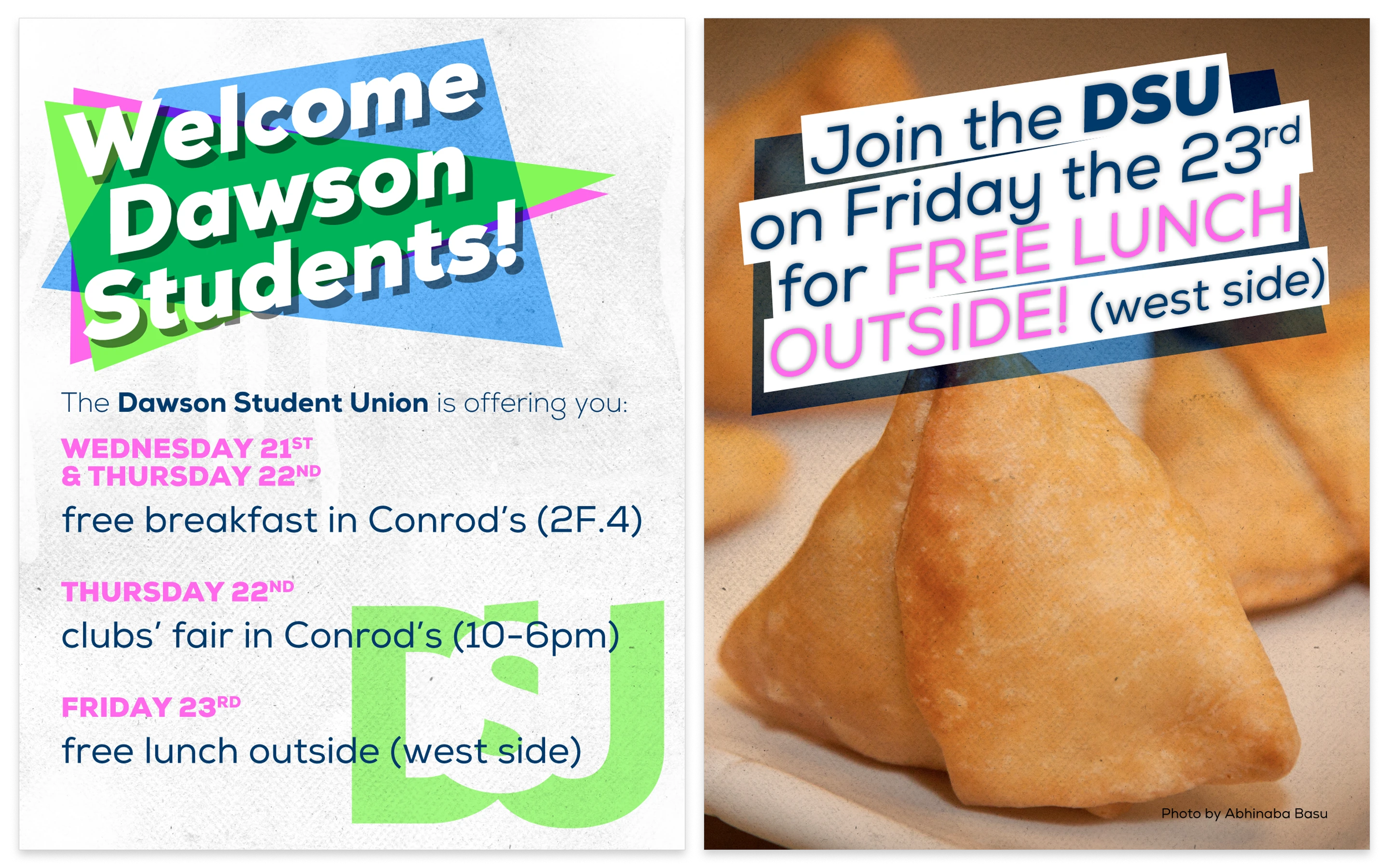
Welcome Flyer
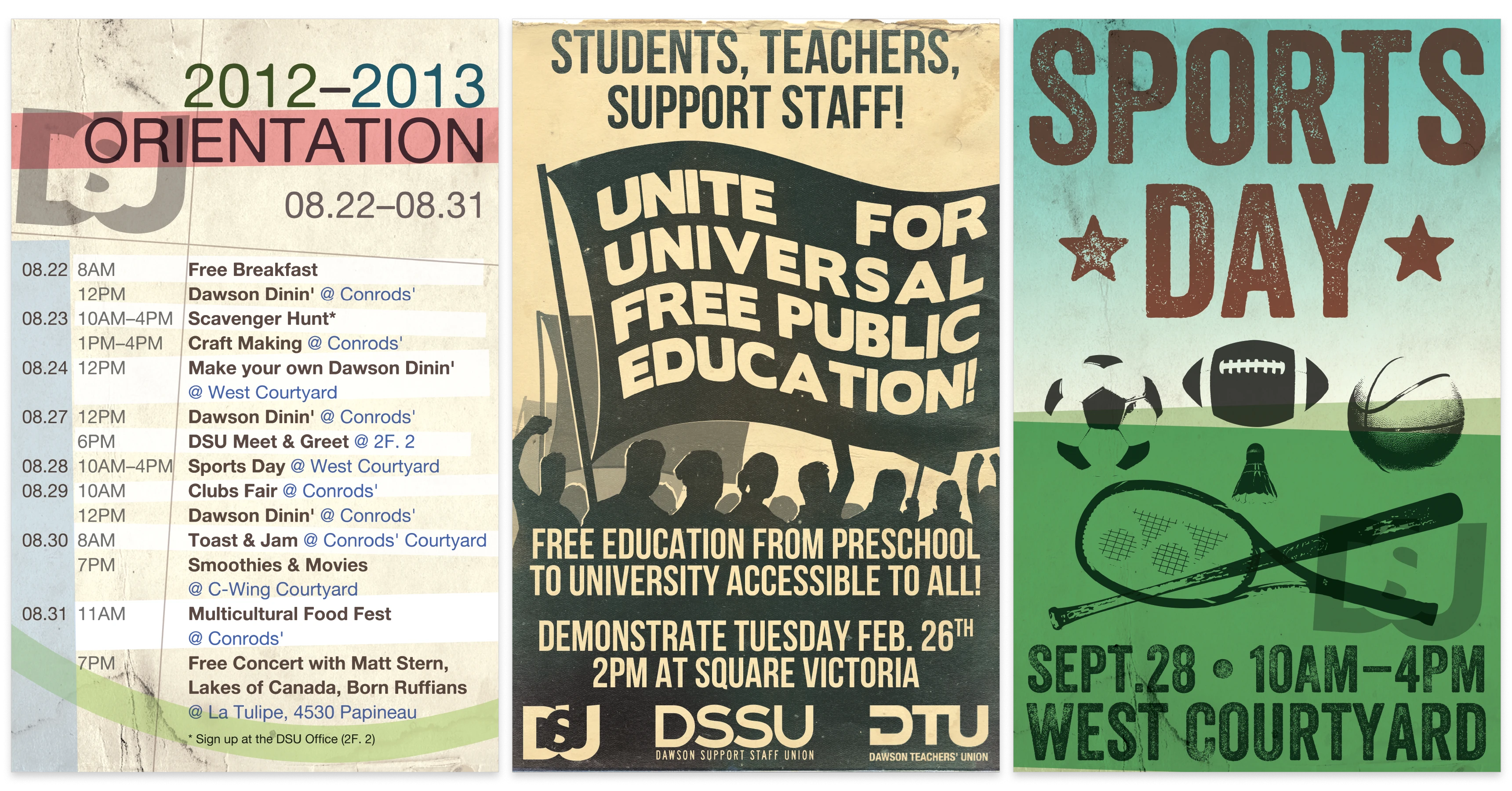
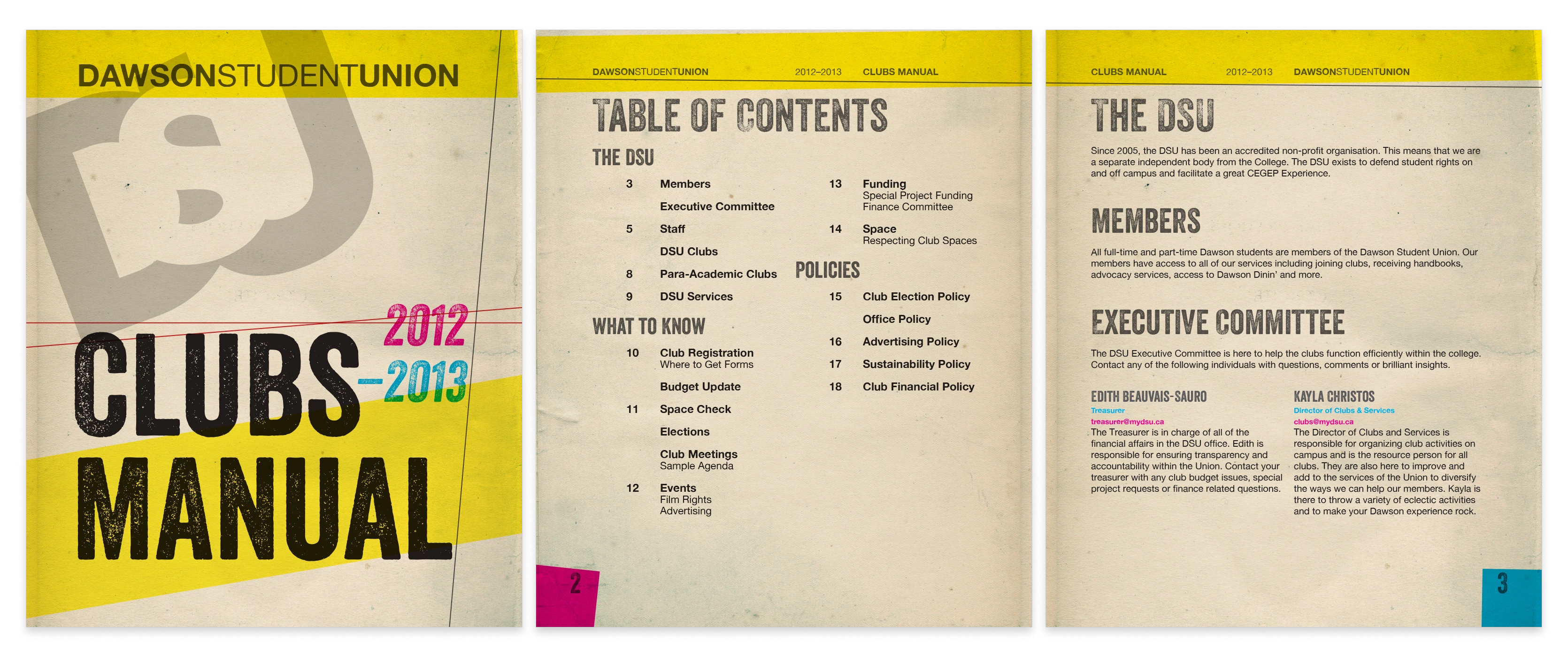
In 2010 I was contracted to do graphic design for the Dawson Student Union. It started with a logo consultation and t-shirt design which lead to regular poster and flyer work for the next four years.
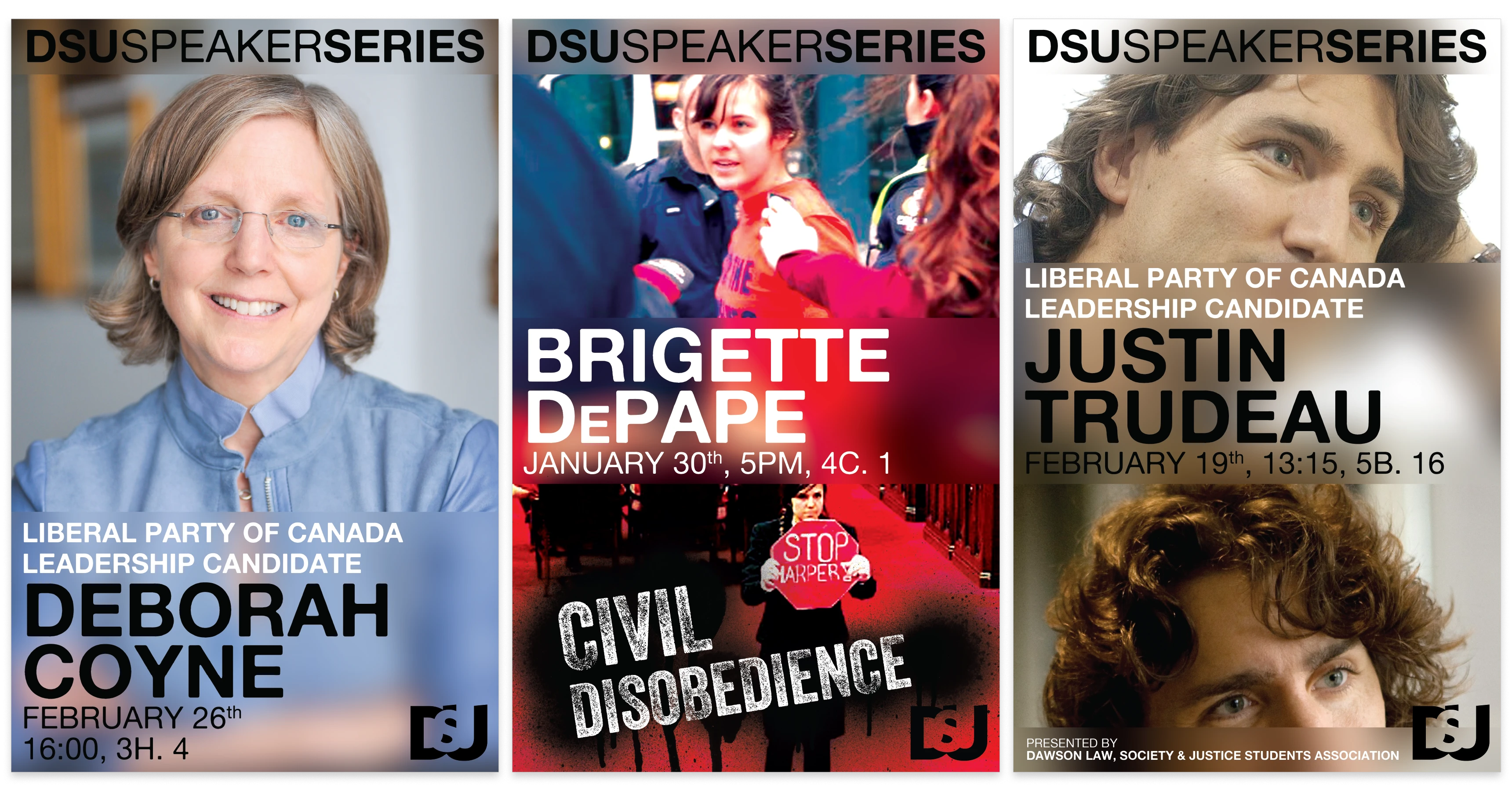
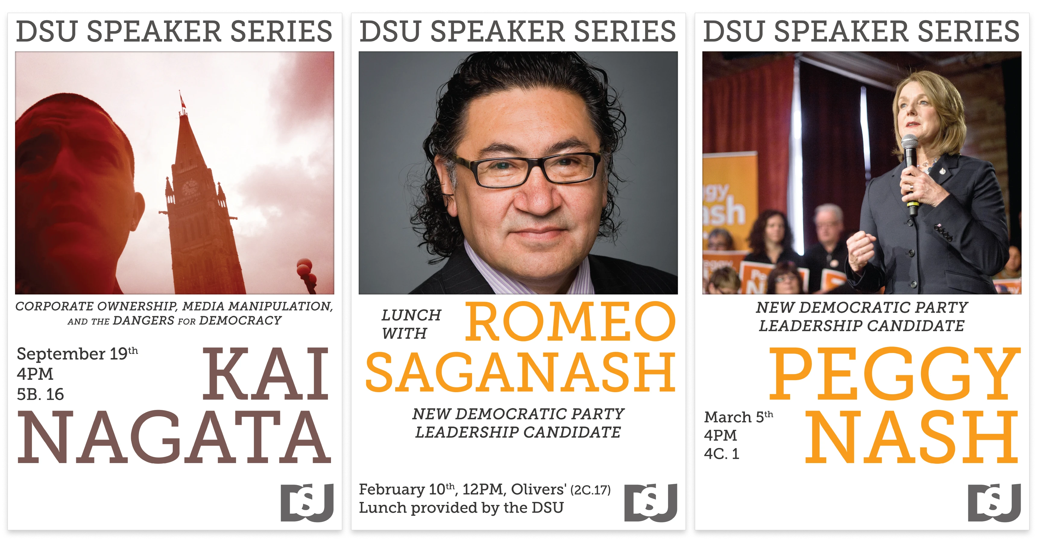
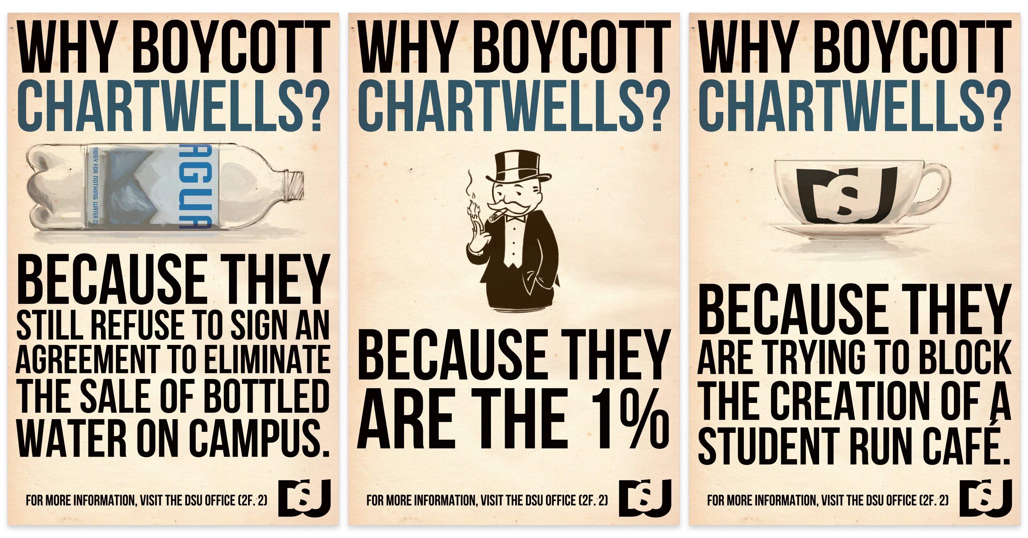
Dawson College, being Québec’s largest CÉGEP, happens to have a fairly politically active student union. They needed a lot of text-heavy, informative design with enticing calls to action. This manifested as a mix of playful design exploration and a harkening back to classic union style propaganda posters. I happen to have an affinity for old propaganda posters, so I was more than happy to toy with that aesthetic.
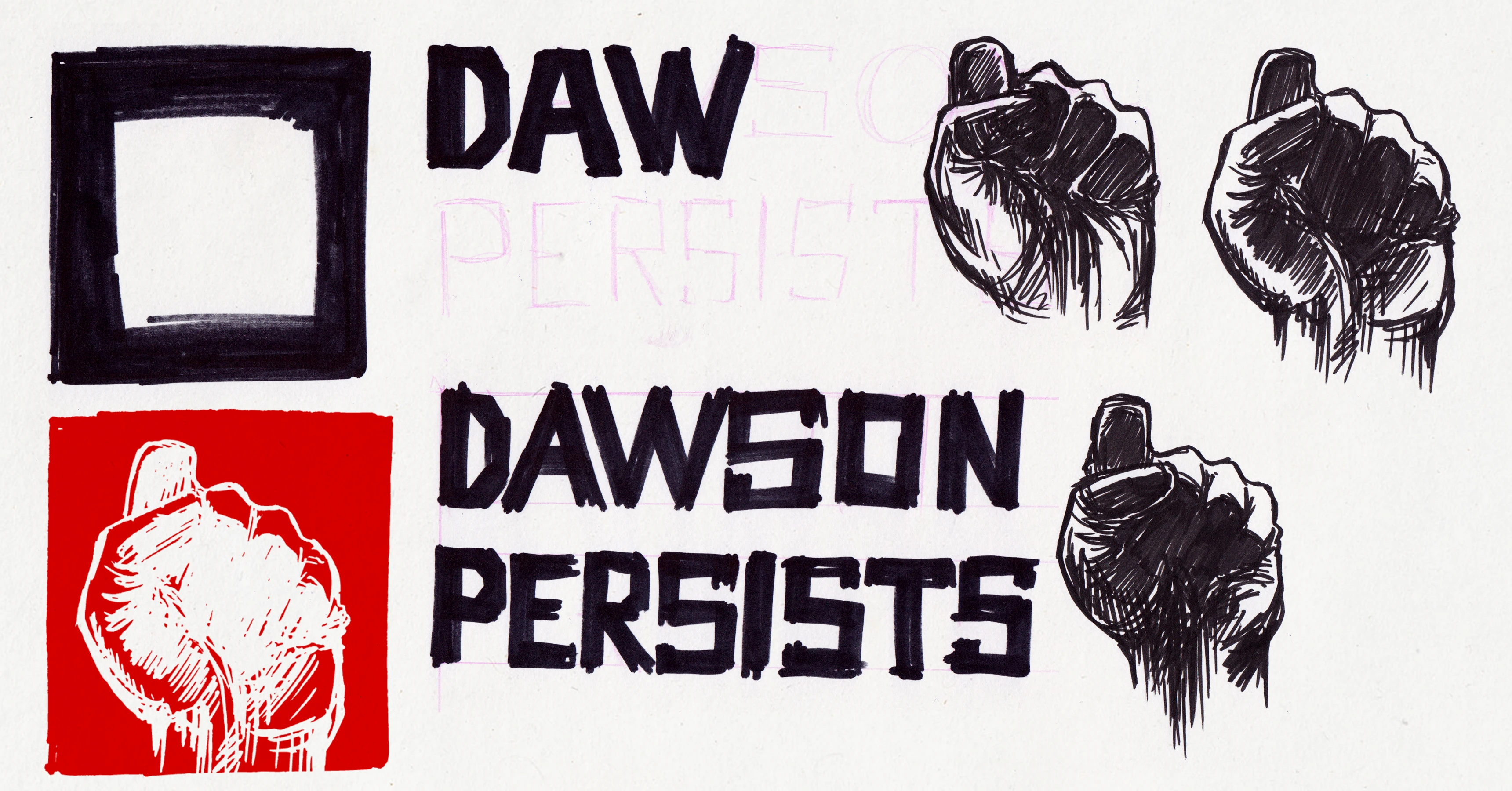
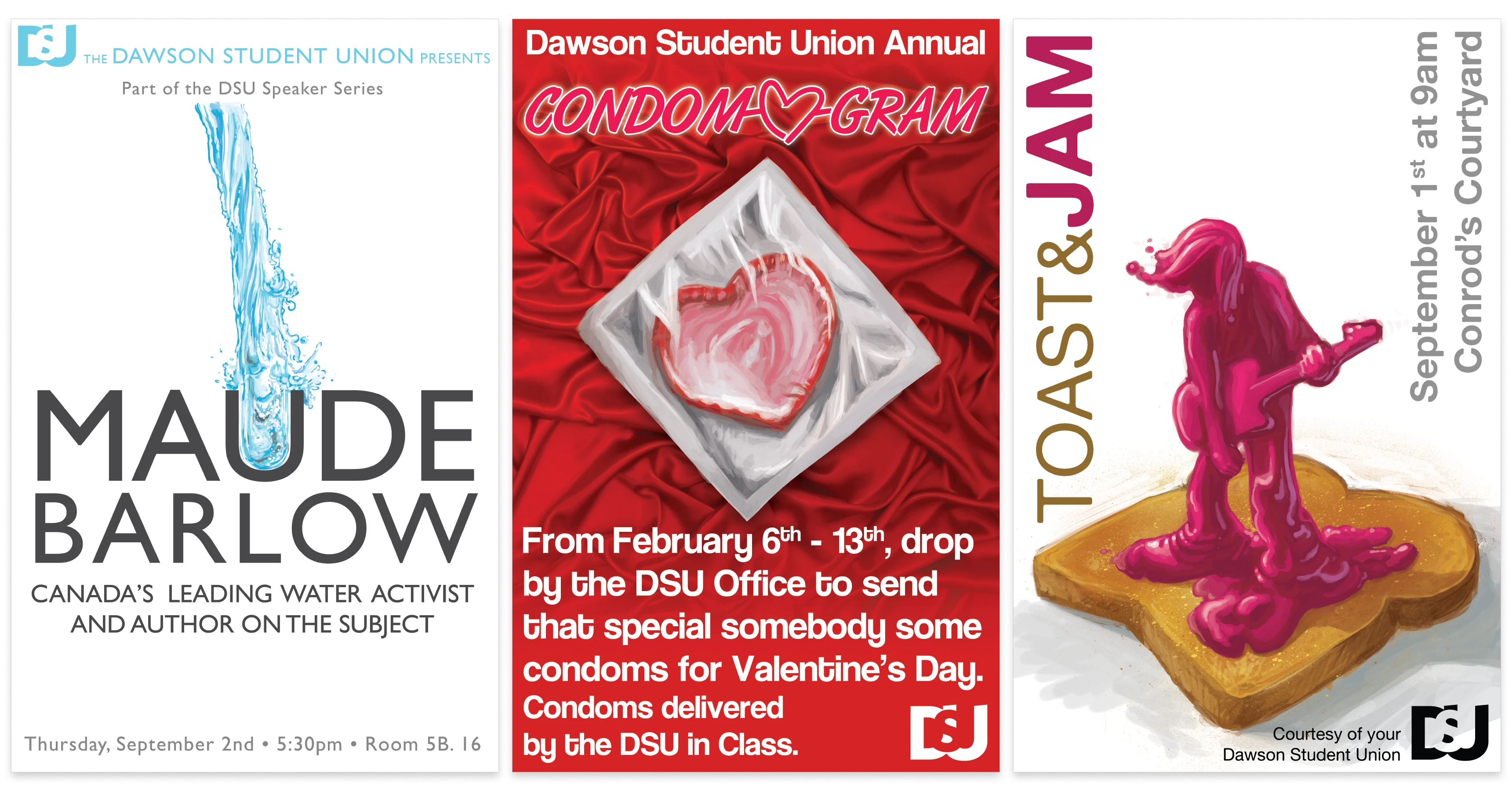
Considering the relatively small design budget of a student union, whenever a piece needed imagery I had two options: find a creative commons image that fit, or draw it myself. While finding an existing image was usually faster, it rarely was exactly right. The posters I got to illustrate myself were always the most satisfying.
Through the Dawson Student Union I also received a few contracts to brand some of the more actively political student groups.
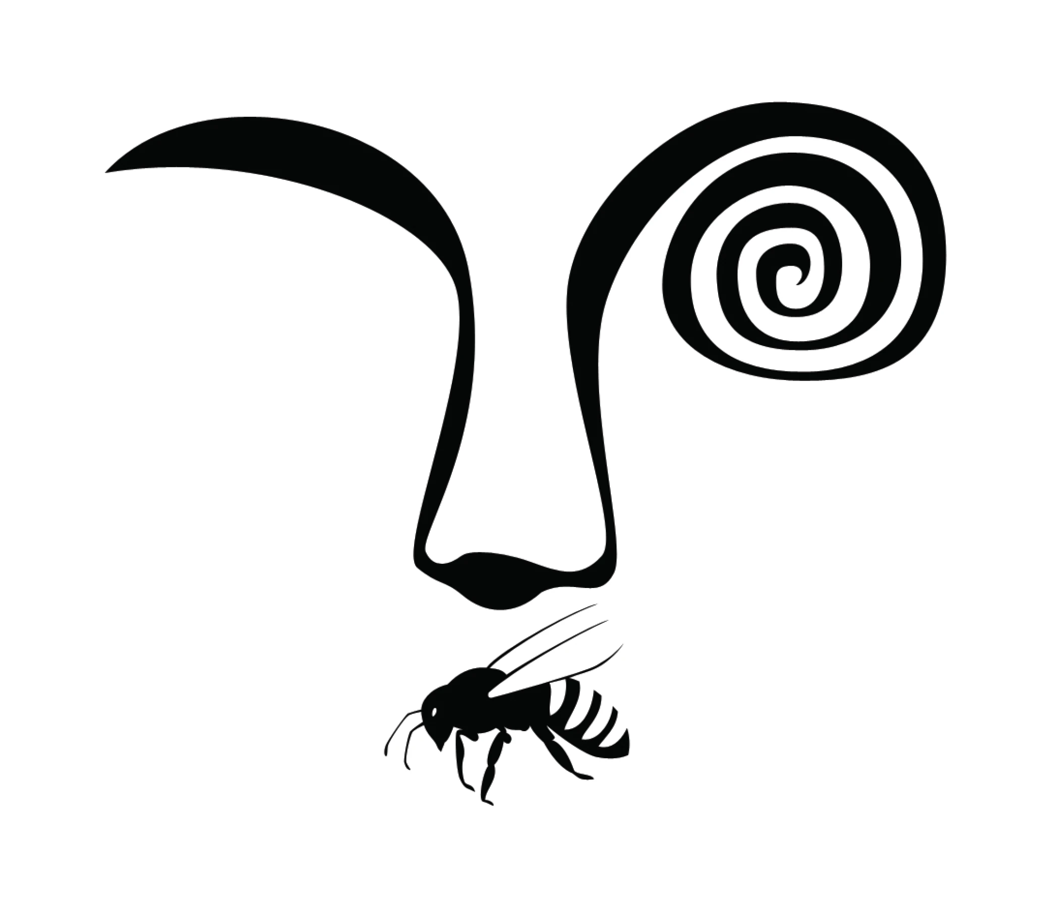
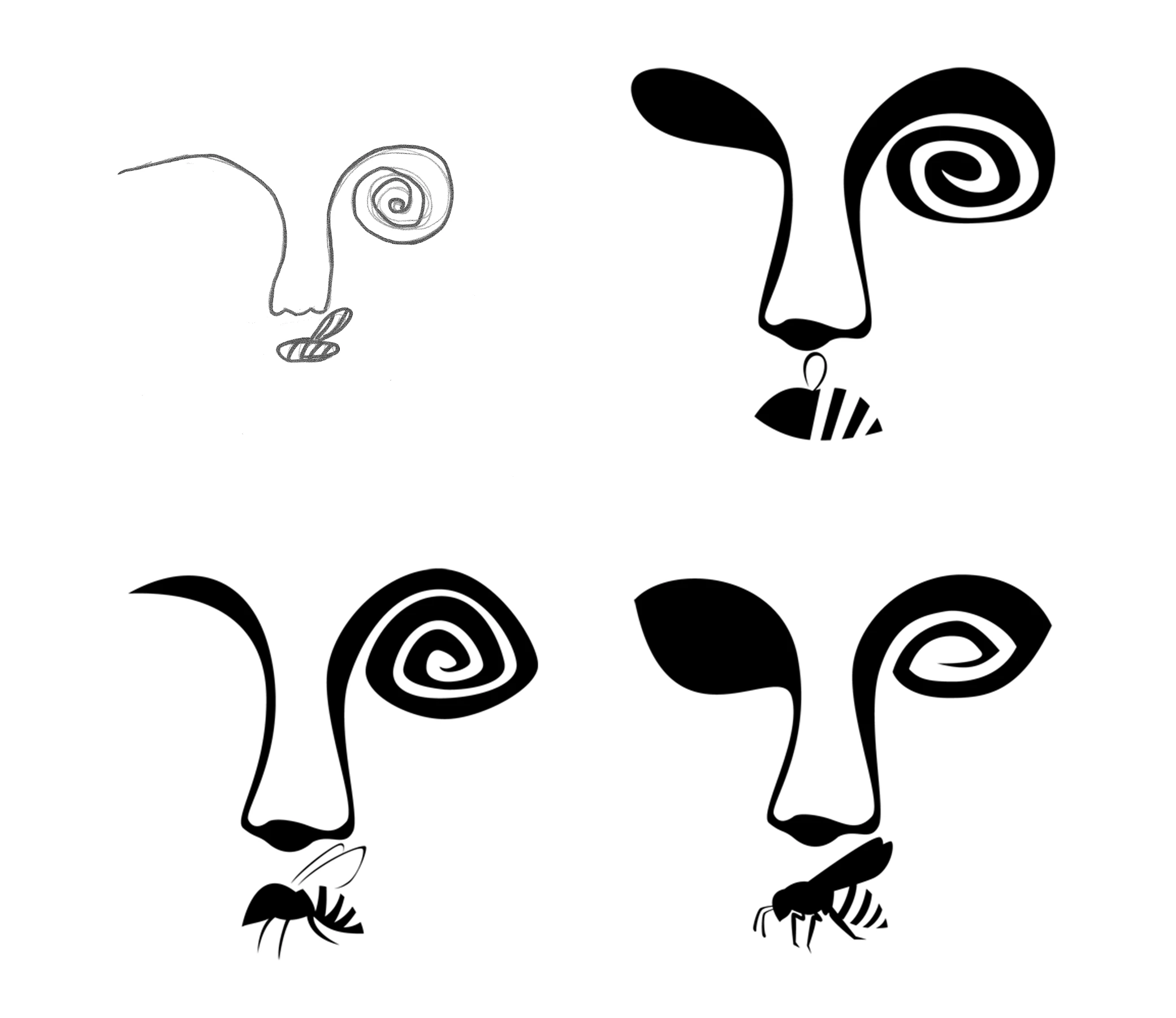
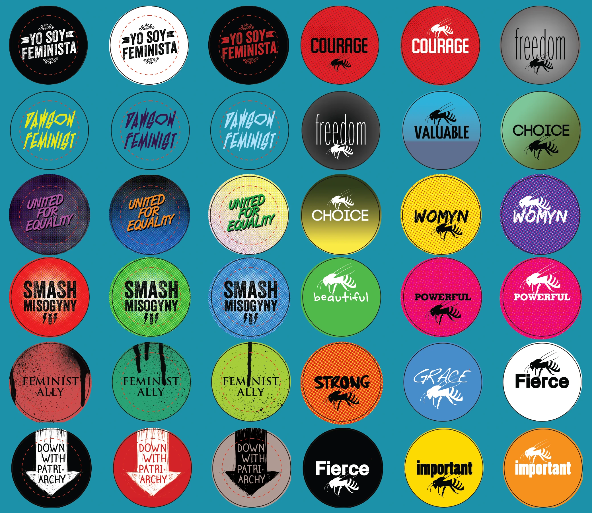
The Hive was Dawson’s Womyn’s group. Their aim was to spread awareness of women’s rights and gender equality.
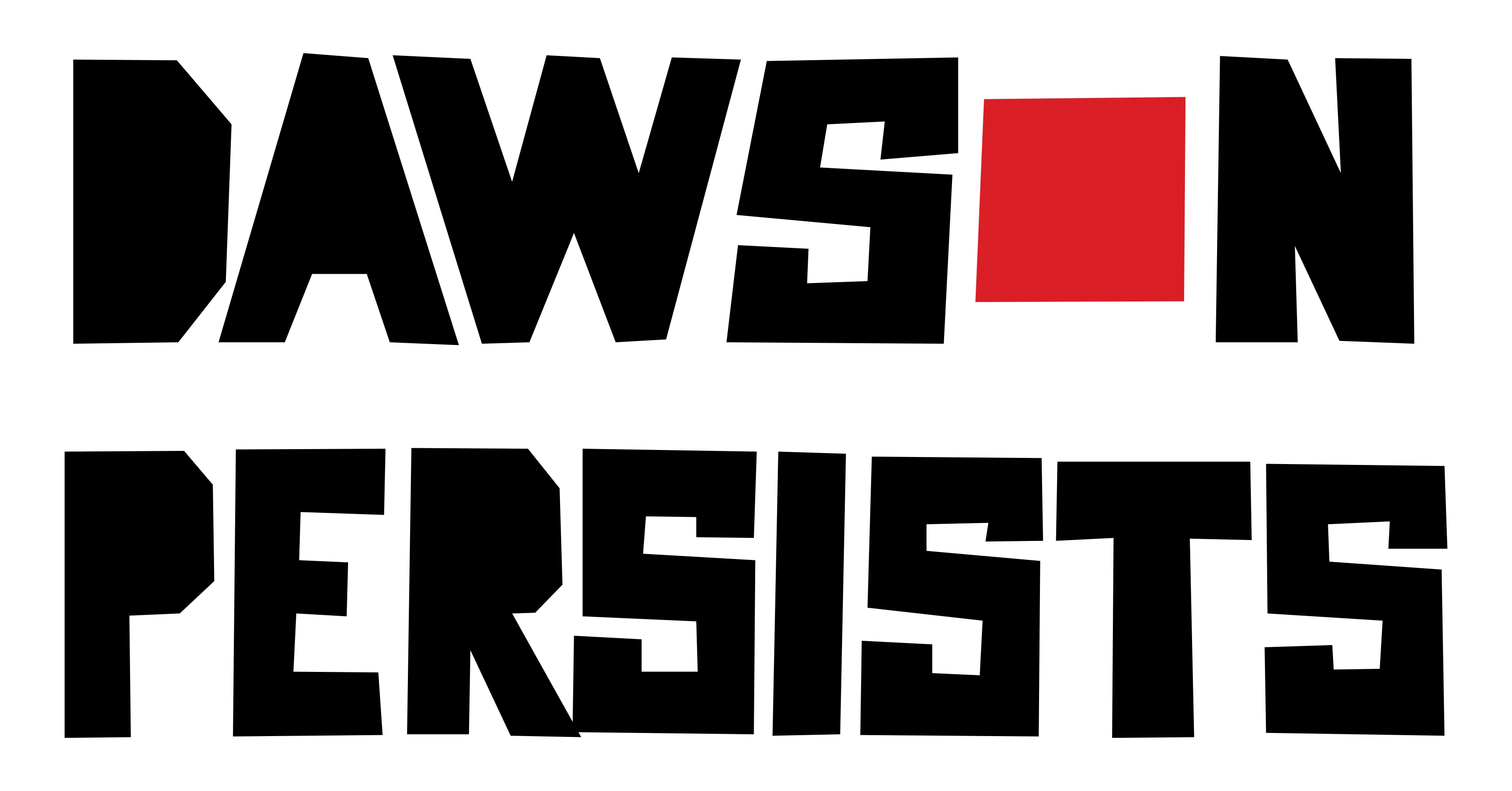
Dawson Persists formed after the loss of a referendum for a student strike. They were determined to fight against tuition hikes. The logo contains the red square symbolic of the Montreal student protests.